We usually see lots of billboards while driving on the road, but we usually didn't pay much of attention to them.MeanWhile, for the final project we were told to create a billboard which we get inspired from the billboard around us. We were allowed to use any media to create the work.
My friends and I start to walk around at the campus and find some billboards for inspiration, I also take some photo of billboards which beside the roads too.
 |
| Fig 1.1 Petronas Billboard |
 |
| Fig 1.2 Billboard around campus |
 |
| Fig 1.3 billboard around campus |
 |
| Fig 1.4 billboard around campus |
I had an idea, which is "spend more time with our family, and it's time to go home".I had this idea while saw the Petronas billboard, it remind me of the advertisement of Petronas which talk about reminding worker going home from work.
 |
| Fig 1.5 Advertisement of Petronas |
Nowadays, there are lots of people who work outside and didn't have much of time to spend time with their family and parents, even Chinese New Year, or other public festivals most of them are still working and didn't go back home.
I wanted to create a billboard that reminds people it's time to go home, so i start off my idea with some draft sketch.
 |
| Fig 1.6 Ideas of billboard |
Ms. Sherry said the second sketch brings out a strong message so i choose that sketch and work on it.
 |
| Fig 1.7 The chosen sketch |
To show a sad and lonely atmosphere, i choose some cool colors as the background and also put the shadow to make the blue feeling stronger.
 |
| Fig 1.8 The background |
Next, I digitize the wheelchair and the old lady (mum), I choose a "older" color for the wheelchair but for the cloths of the old lady, I choose a brighter color to show the contrast of the lady and the background (the sad atmosphere), there are some reason why I want to show the contrast, and i will explain it later.
 |
| Fig 1.9 The wheelchair |
 |
| Fig 2.0 The old lady with wheelchair |
After that, I digitize the food and table, it was the reunion dinner food. Chinese used to have a reunion dinner on Chinese New Year Eve which everyone will come back home to have a dinner with family, it was traditions of Chinese.
 |
| Fig 2.1 Add table |
 |
| Fig 2.2 Food on table |
Besides, I add on some lanterns and blossom to show it was during Chinese New Year. And also the headline of reminding people "It's time to go home"
 |
| Fig 2.3 adding decoration |
 |
| Fig 2.4 Add blossom |
I also add the clock and the lamp to show it is night time
 |
| Fig 2.5 Add lamp and clock |
This is the final outcome
 |
| Fig 2.6 The final outcome |
For this work, It talks about an old lady cooked the reunion dinner and waiting for her children come back home to have a dinner with her. But it seem that, her children didn't come back, as you can see it is over the dinner time, it was already 9pm.
If you look at the old lady, she looks sad and disappointed while looking at those food which were not eaten yet. We can strongly feel how sad she is. She wearing bright color cloths which means she dresses herself well and she was excited to see her children.
For this project, the design principles that i use are:
- Repetition:The repetition of the petals and the flowers, and also the laterns
- Balance: To balance the whole artwork, i choose the darker color for the background and some brighter color for the old lady, table and food (things in front) so the color of the whole picture won't be too sharp or dark.
- Harmony:
The harmony of the color between old lady and the background, they looks similar but different and the green color background match the whole atmosphere and also others things such as the red lantern or the red table
- Hierarchy: By using some brighter color for the old lady, table and food, we can see the hierarchy of the whole figure, the old lady and the food is the main thing and it brings messages
Last but not least, we must be grateful that our parents are still alive. We should cherish the time that we can still get along with our parents and bravely tell them that we love them.
PROJECT 2
For Project 2 we were told to create a composition poster with different elements. For the elements which need to combine is the photo that we take currently. We can choose a place we like or maybe is meaningful for us. Like home, Mc Donald, classroom and so on.
First i struggled about which place should i choose. After Ms Sherry shows the work that a senior did , which is about Mc Donald , the first places which pop out in mind is the fast food restaurant"Texas Chicken". I really like the chicken there, it taste juicy and the chili sauce is really nice.
Suddenly, i heard someone said " Xuan, are you going? When does the bus come?"
After that, i decide to choose the bus stop as my chosen place.It is because, as i live at Suriamas, which is quite far from campus, and everyday i need to take the Taylors shuttle bus to university and of course go back to home. Everyday i spend quite lots of time waiting for the bus at the bus stop because sometimes the bus didn't come
Now let's get start to do it!
First, these are the photo that i take for this project:
 |
| Fig 1.1 The seat of bus |
 |
| Fig 1.2 The bus ticket (1) |
 |
| Fig 1.3 The bus ticket (2) |
 |
| Fig 1.4 The stop smoking sign at bus stop |
 |
| Fig 1.5 The taylors bus ( but not the bus that i take everyday) |
 |
| Fig 1.6 The waiting place |
First of all, I put the seat of the bus on top of the work as i want it to become the sky
 |
| Fig 1.7 The sky |
Then, I put the bus image on it. This is the taylors bus but not the bus that i take for everyday because everytime i don't have time to take a properly and pretty pictures for the shuttle bus as the bus will go away if i'm not in time and also there are lots of people there , so i can't take a proper picture for it.
 |
| Fig 1.8 The gorund |
Next, I crop out the bus as i want everything is in black accept the bus and also the arrows
 |
| FIg 1.9 Cutting out the bus |
I put the black and white filter and also the "do not smoking" sign. I put the sign in the sky cause i want to make it looks like the sun but a sark sun because it is about to rain! I also add some cloud on the " bus seat sky"
 |
| Fig 2.0 Adding the B&W fitlter |
I also put the arrows as the direction of which way the bus usually left, and also the bus ticket as the road
 |
| Fig 2.1 Adding elements |
These days, it rain often so i make some "rain" by using the red words on the tickets. Mostly 5 days, there will be 2 days that is raining while i waiting for the bus.
 |
| Fig 2.2 Adding the rain |
Lastly, i finally add the bus and the "wawasan sutera" words which on the bus tickets and my composition is done
 |
| Fig 2.3 Finally adding the bus |
Actually there is another meaning inside, as it is black and white and also raining, it also reflect of my own feeling while waiting for the bus. I am a Sabahan and i need to go back home alone in this unfamilar city, I feel very lonely and the bus is the transport that help me back to my little room for a rest so it is in color.
 |
| Fig 2.4 Final Outcome |
For the design principle that i used in this project is:
- Contrast:
We can clearly see the strong contrast between the black and red color which show in the artwork
- Direction/ Movement:
The arrows create a direction that going the particular way and looks like that bus is going to the way
- Pattern/ Repetition: The "rain" makes a pattern and actually is repeating the word "Wawasan Sutera"
PROJECT 1
We were required to do our own self- portrait with using any media. For this project, we need to create an artwork which show who you are, and what is your personality. Ms Sherry also said that in our self-portrait, it is not necessary to have our own face in it.
At first, i want to draw lots of cute stuff to show the personality that is childlike, but it seem not really work, and childlike is not the whole of me , it is just a part of me. When i am looking at some self portrait that others artist made , i saw there is a portrait that create by words.
 |
| Fig 1.1 The reference portrait |
I feel that using all the words that describe me can clearly show who am i. So I started to work on it.
 |
| Fig 1.2 Selfie of me |
I choose a photo of me, and start to sketch my face on the paper
 |
| Fig 1.3 The draft of the artwork |
After that, i use ruler to draw a line in the middle , and start to work of the right side of my face. I roughly shade the place that i want to work on with words, so i can write in a easiest way
 |
| Fig 1.4 The shading of the right side |
I started to write on it, as you can look at the detail of it, the bigger word is the word that is more important to me
 |
| Fig 1.5 The progress of doing it |
- God: As i am a christian
Draw: I really like to draw, i usually draw a lot when i am free
Dance: Dance is also one of my hobby, i used to dance a lot in the pass three years
 |
| Fig 1.6 Finished the right-hand side |
There are also some details that i want to mention:
- The ear is a "19" as i am 19 years old
- There is a love in my eyeball, as i am taught to love everyone around me, love them as how i love myself. This world should be full of loves and it is also a remind for me
- There is also a short message for my lovely classmate!
 |
| Fig 1.7a Details |
 |
| Fig 1.7b Details |
For the left-hand side i didn't do anything special, i just use watercolor to color it. I didn't color it in black & white but in a colorful way, because i want to show the contrast between both side and I want to show the outside me.
 |
| Fig 1.8 Finished the left-hand side |
For the whole artwork, there is a idea there. For the left side is the outside of me, is colorful is about no sadness. For the right side is the inner me. It is full of my own expression, and also lots of remind for myself. There are also lots of words that i try to be, faithful, be positive and so on. There is still lots of things that i want to change and improve, and this artwork can remind me.
 |
| Fig 1.9 The final artwork |
The design principles that show in this artwork:
- Symmetry & Asymmetry:
The first design principle we can see in this artwork is symmetry and also asymmetry.It is symmetry that everyone's both side of face is the same but it is also asymmetry that one side is full of words and in the color black & white but the other side is striking different from the right-hand side
- Contrast:
From the color we can already see the contrast between both side. Next, the way of present of both side is also different, one is watercolor, one is black ink pen.
- Texture:
For the texture, the tiny words show a visual texture and also it also looks like it may have a particle touch.
Lecture 7 : Rhythm, Harmony & Movement
This week we will talk about rhythm,harmony and movement.
Rhythm: Regular rhythm follows a constant interval over and over again and can be made with any element as long as there is consistent repetition of the same element
- Rhythm Can be created through a regular repetition of sound (in music) or pattern.
- Rhythm and Movement always coincide within Design as they both make use of the interval of space
Regular rhythm
- Regular rhythm follows a constant interval over and over again and can be made with any element as long as there is consistent repetition of the Same element
Random rhythm
- This type of rhythm doesn’t have any particular sense of flow or direction when using this type you have more freedom and little to no restrictions
Flowing rhythm
- This rhythm shows a series of curves,bends and undulation
Alternating rhythm
- repeat to make more an one element
Progressive rhythm
- The elements repeat here over an interval but with more variation,usually in gradual steps
Harmony:Harmony is the quality of how the visual elements are working together in a composition
- All harmony and no contrast, however, can become monotonous, which means dull, tedious, and repetitious
- The repetition of design elements like colour (adjacent colours), related texture, similar shapes, and forms.
Movement:Movement is the path the viewer’s eye takes through the work of art,often to focal areas.
Anticipated Movement
- Live figures portrayed in unstable body positions cause us to feel that motion is imminent.
Fuzzy outline
- When figures move past us at very high speeds, we perceive that figure as somewhat blurry.
Multiple Image
- Similarly, showing multiple overlapping images gives us the impression of motion.
Optical illusion
- Certain optical illusions based on the repetition of geometric forms will cause your eye to produce motion where none is present.
Exercise 7
Rhythm, Harmony & Movement
For this assignment, we had to create an artwork within these principles. I choose movement to create my artwork
I want to do a kicking movement of the athlete , and it makes from different motion, action of a athlete.
First i find a photo of a football player, and cut it out
 |
| Fig 7.1 The football player |
Next i draw the others motion of him and make it the different color to clearly see the series of the whole action of kicking football,and cut it out too
 |
| Fig 7.2 After cutting out |
Next, i clue all of these on the green paper first. But it seem, it didn't come out well, it doesn't make those "motion" pop out , so i decide to paste these on a black paper
 |
| Fig 7.3 First try on green paper |
Obviously, the black paper clearly show the contrast between both the black and the others color, and it looks better than the green paper
 |
| Fig 7.4 Final piece |
It is a time frames of the whole kicking movement.
Lecture 6 :Dot, Line, Scale & Size
Dots:
- The smallest and most basic element of design
- Designing with dots can create a wide variety of visual effects
- There are various associations that can be made with positioning a single dot in different areas of a page
The repetition of Dots create:
- Creates textures
- Optical illusion
- Pointillism
- Makes vivid and stimulating effects through combination of different sizes.
Lines:
- A path trace by a moving point
VerDiagonal Lines:
- Suggest action and movement.
- They convey dynamism, vitality, and animation.
Tical Lines:
- Suggest alert attention.
- They imply strength, power, and authority.
Horizontal Lines:
- Can be landscape and the horizon
- They convey peacefulness, vastness, and constancy.
- Organic Lines
- Found in nature
- Convey a sense of gracefulness, dynamism, and spontaneity
Geometric Lines:
- Mathematically determined
- Often found in man-made constructions
- Convey a sense of order, conformity and reliability
Implied Lines:
- Lines that we see in our mind’s eye
Actual Lines:
- Objects that are real lines; they exist physically
Size:
- How big or small an element is in relation to other objects
- Simply the relationship of the area occupied by one shape to that of another
- Used to convey important, attract attention and create contrast
- To make a particular element stand out or give it importance
 |
| Add caption |
Scale:
- Scale refers to the size of an object ( a whole) in relationship to another object ( another whole).
- In art the size relationship between an object and the human body is significant.
- In experiencing the scale of an artwork we tend to compare its size to the size of our own bodies.
 |
|
Dots,Line,Scale &Size
For this exercise, we can use dots and lines to create our artwork. I choose dots to do my works as i had create these type of artwork before so for me, using dots is more easier to me.
First, I want to draw a leopard but i accidentally saw a lion picture and i decide to use dots to draw the lion. I feel really excited, because it is a challenge for me .
I roughly sketch out the lion face and start to stippling on it using my black pen.
 |
| Fig 6.1 The eyes of the lion |
After that i draw the lion's hair out using pencil, so it is easier to let me know how the hair will be like
 |
| Fig 6.2 After finish the lion face |
Because it will takes a lot of time i simply dots out the outline and continue stippling on it.
 |
| Fig 6.3 The rough outline of the hair of lion |
After about 5 hours front on my table, it finally done! It really train my patient, because everything is dots and even the black part and the lines. This is the final outcome of my art work.
 |
| Fig 6.4 The Lion |
Lecture 5 :Hierarchy, Alignment,Direction & Perspective
08.05.19 ( Week 6 )
This week Mrs Sherry gave us a lecture about what Hierarchy,Alignment,Direction and Perspective
Hierarchy:
is the order in which a user process information on a page, its function in UI design is to allow users to understand information easily
It helps signal the importance of each elements
Alignment :
is the way visual elements are arranged so that they line up in some way
Direction:
All line have direction and there are three common direction in design
- Horizontal : calmness,stability and tranquility
- Vertical : balance,formality and alertness
- Diagonal: movement and action
Perspective:
Indicates depth in a two-dimensional image. Perspective is the tool we use to indicate depth.
Exercise 5
Hierarchy, Alignment,Perspective & Direction
We are required to photo some photo which is currently but not the past photo. So all of us started walking around the campus to photo some pictures we need to use in our exercise.
After that we need to work on our photo by using Photoshop
 |
| Fig 5.1 the original photo |
This is the photo that i take in my friend apartment from the 5th floor, and i start to work on it . I want it to become prettier and dreamy so i decide to put a sky that full of star
 |
| Fig 5.2 photo after photoshop |
This is the outcome of it but Mrs Sherry said if i want to show perspective i do not need to put any things on it
 |
| Fig 5.3 original photo |
This is another photo i take in the campus. It is just outside the classroom.I try to work on it and make it become hierarchy
 |
| Fig 5.4 first try |
Mrs Sherry said that she know me want to make my photo become fun but it didn't show hierarchy because of the word " call me maybe " so i redo it again
 |
| Fig 5.5 second try |
Lecture 4: Surface,Repitition,Pattern and Texture
24.04.19 ( Week 4 )
This week we learn about what is repetition, pattern, texture and surface is.
- Pattern : repetition of design elements which can divide into seamless (never ending) and finite ( with end ). It's uses is attract attention and rhythm
- Repetition: reusing the same or similar elements throughout your design.It bring a clear sense of unity,consistency and cohesiveness.
- Texture : can be broken into two parts which is physical and visual
*
Physical texture: texture that you can actually feel with your hand,all things that change the nature of a surface
*
Visual texture: the illusion of physical texture,created with the materials you use.
Keywords: smooth, glossy, fuzzy, hard, rough
 |
| Pattern |
 |
| Repitition |
 |
| Texture |
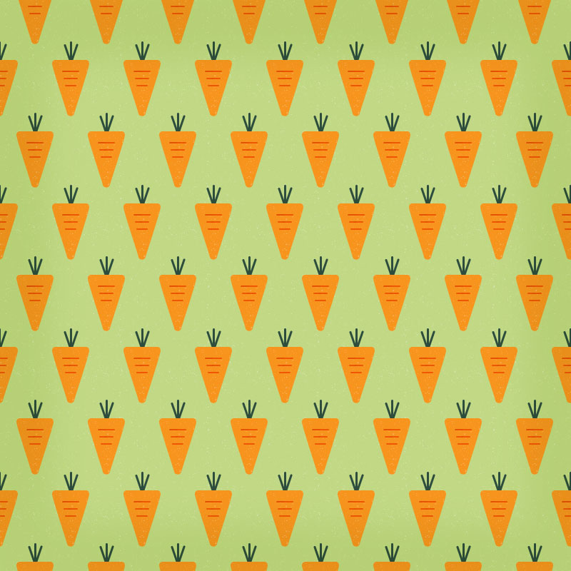
This week, our exercise was about using any vegetable or something else,just what ever you want ,and use it to create a pattern
Exercise 4
Pattern
I like pineapple and cactus, and it become my pattern inspiration. I use potato and carrot and cut into the pineapple and cactus to create the pattern
 |
| Fig 4.1 cactus |
For the pink "cloud" behind i use a cotton wool balls to create it.
 |
| Fig 4.2 pineapple |
I color the potato with two color which is orange and yellow so it became more colorful
FEEDBACK
Ms Sherry said this is totally a pattern but we can just using very simple item and no need to be complicate, but she say my work is quite fun and it is a pattern
Lecture 3 : Balance, symmetry and asymmetry
17.04.19 (Week 3)
Today is our team to present and give a lecture about balance, symmetry and asymmetry. We had prepare about one week and this is what we talk about.
Balance is the distribution of the visual weight of objects, colors, texture, and space. If the design was a scale, these elements should be balanced to make a design feel stable.
Symmetry is the elements used on one side of the design are similar to those on the other side.
Asymmetry is the sides are different but still look balanced.
After our present, Ms Sherry talk more about the balance, symmetry and asymmetry so that all of the students will more understand about it.
We are required to do a artwork with pastel or watercolor which you can do symmetry, asymmetry or balance.
Exercise 3
Balance, Symmetry and Asymmetry
I have chosen watercolor for my artwork.
 |
| Fig 3.1 |
I sketch out the draft of my artwork. I draw a big guy which is Mat hat in" Alice in the Wonderland" and draw a small girl which is Alice in the cup.
 |
| Fig 3.2 |
I want to show the balance between the Big and Small people with coloring the Mat hat with some darker color so it won't sharper then the small people and color Alice in bright color, so the Mat hat and Alice will become more balance with the color. I color the table and the sky in black and white but not with some bright color also because to pop out this two character.
 |
| Fig 3.3 |
After all the coloring i draw the outline with black color and this is the final piece
FEEDBACK
Miss Sherry say that the little girl didn't pop out because of the cup but she say i did a nice job on the watercolor
Lecture 2: Gestalt
10.04.19 (Week 2)
This week we learn about Gestalt.It is about how humans typically see objects by grouping similar elements, recognizing patterns and simplifying complex images. Our brain sometimes can drawn out and fill in the details of an object which doesn't sum properly.
- Closure- People usually will automatically fill in the gaps between elements and drawn out a complete image.
- Continuation- People's eyes and brain naturally follow and drawn out lines to complete a incomplete figure
- Similarity- People link the similarities in an image and automatically perceived the elements as a group
- Proximity- We place the elements which is closer and become a new image
Here is some examples of Gestalt:


We received a "mission" to do a gestalt exercise.
Exercise 2
Gestalt
10.04.19 ( Week 2 )
In this exercise, we are only allowed using black marker to complete our work.For me, this exercise is really tough. At first i do a lot of research finding an idea but i still can't draw out any thing. Seems that i'm still not understanding the meaning of Gestalt, my friend start explaining about it and i pop out some ideas in my little brain.
 |
| Fig 2.1 |
I sketch out some draft and choosing the design which present more about Gestalt.
 |
| Fig 2.2 |
This is the final design i choose and draw it out with black pen and fill in with the black marker.
This is about the love between a father and a child, as we can see a love, a small hand holding a finger of a big hand,and between the big hand there is a man head which is the "father's" head.
FEEDBACK
Mr Sherry say that she can clearly see the hand, heart and the head. It was not bad cause she wants a gestalt artwork which is not complicate
Lecture 1 : Briefing
03.04.19 (Week 1)
The class began with a small briefing of our module . After that, Ms Sherry asked us to introduce our selves to new classmate and draw their face at the same time. The art works was hanging out after a small break. We get to know each other and Ms Sherry and Ms Anis also introduce themselves too
Next, Ms Sherry continue the class with a lecture about the introduction of contrast. She also show us some examples of contrast.
For instance :
- Colors
- Size
- Shapes
- Texture
- Rhythm
- Movement
- Angles
- Font
Here is some contrast examples :

After that, we were requested to do a contrast exercise based on color contrast
Exercise 1
Contrast
03.04.19 ( week 1)
In the first class, we were asked to do a exercise based on color contrast. We could only use black and white A4 paper to complete our work. Cut the black paper or white paper and paste on the white or black paper, to show the color contrast between it
 |
| Fig 1.1 |
I sketch out the draft, and try to add design on it. This is my self-portrait of my half face .
 |
| Fig 1.2 |
I cut out two different contrast with black base and white base. I began to chose which can show the message that i want to bring out more.
 |
| Fig 1.3 |
I finally chose this as my final work because it significantly show the striking different between black and white .
Everyone has their own secret side deep in their heart and i want to shows that the different side inside me. The two different personality present by the color black and white.
 |
| Fig 1.4 |
 |
| Fig 1.5 |
Fig 1.4 & 1.5
The inspiration of my design
FEEDBACK
Ms Sherry like my work, she said the line that i added can pop out the "head of me " .


Comments
Post a Comment